Boletia
Landing events:
Improving the way to buy tickets online for your upcoming events
🎟️
Overview
Boletia is a leading ticketing platform in Mexico, acting as the bridge between attendees looking to purchase tickets for events and organizers who create physical and digital experiences. Boletia offers event’s management solutions, from ticket issuance to on-site staff coordination.
📝 Context
Event organizers seek digital tools that enable the setup and sale of tickets for active events. Boletia provides to attendees a platform that helps them select and purchase tickets, allowing them to attend their favorite events.
⚠️ Problem framing
Users face various difficulties when purchasing tickets online, as they often feel overwhelmed by the wide range of options and the appearance of hidden costs, which complicates decision-making. This situation decreases the probability of complete the purchase, generates frustration, and in many cases, leads to drop-off of the process.
🎯 Objective
Simplify and optimize the ticket selection and purchase process on the Boletia.com platform to facilitate decision-making and improve the buying experience for potential attendees.
🛠 The process
It was essential to start by identifying the friction points that the user experiences throughout the purchasing process and gaining a clear understanding of the objectives to be achieved. This allows to define an effective user journey that optimizes the user experience and facilitates to know and solve their needs.
Points to consider:
- Performance and efficiency
- Accessibility
- Average time
- User effort
- Design and functionality
🔍 Discovery
Methodological tools
Desk Research
Analysis of existing data that helps to understand the current state of knowledge, identify trends, competitors and inform decision-making.
Remote interview
Discover usability detecting pain points and understanding the behavior before, during and after the event.
Interview with stakeholders
Align the expectations, understand the business necessities and define the scope and the viability of the project
Heuristic evaluation
Analize and detect area improvements using a framework to improve functionalities, composition and navigation
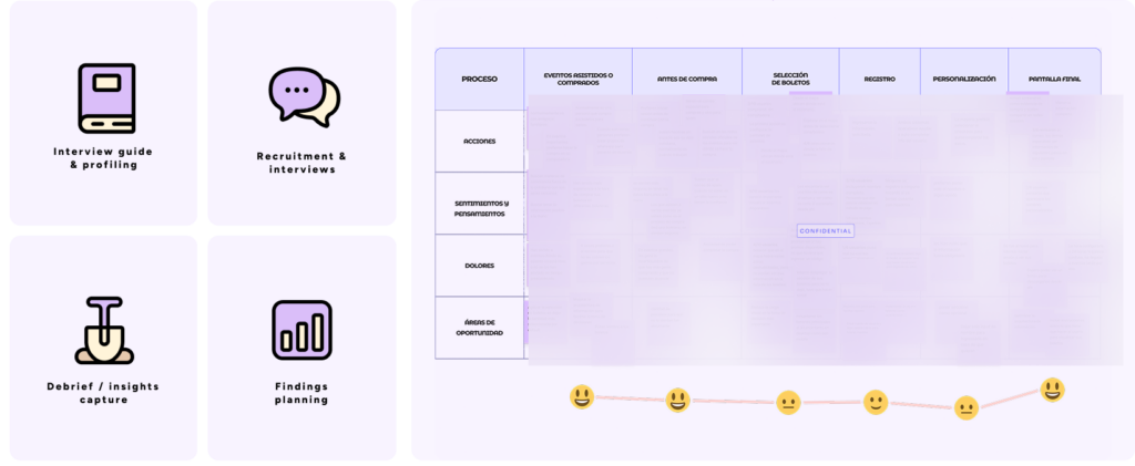
🩺 Usability testing
Made 10 usability test with friends and family in order to detect valuable insights from the early stages, helping to identify real pain points in the current purchasing processes and understanding their behaviors before, during, and after the event.
The time to deliver the design did not contemplate to have a approach with real user ( This was the first time ). I was running out of time that’s why I decided to ask for help to my co worker and product designer Mariana Huipet to run a usability test with friends and family. The recruitment was focus to interview people who was purchase tickets online and attended an event in the last month.
The most frequent pain points for users were selecting tickets, entering their information, and being unaware of the receipt of their purchased tickets.
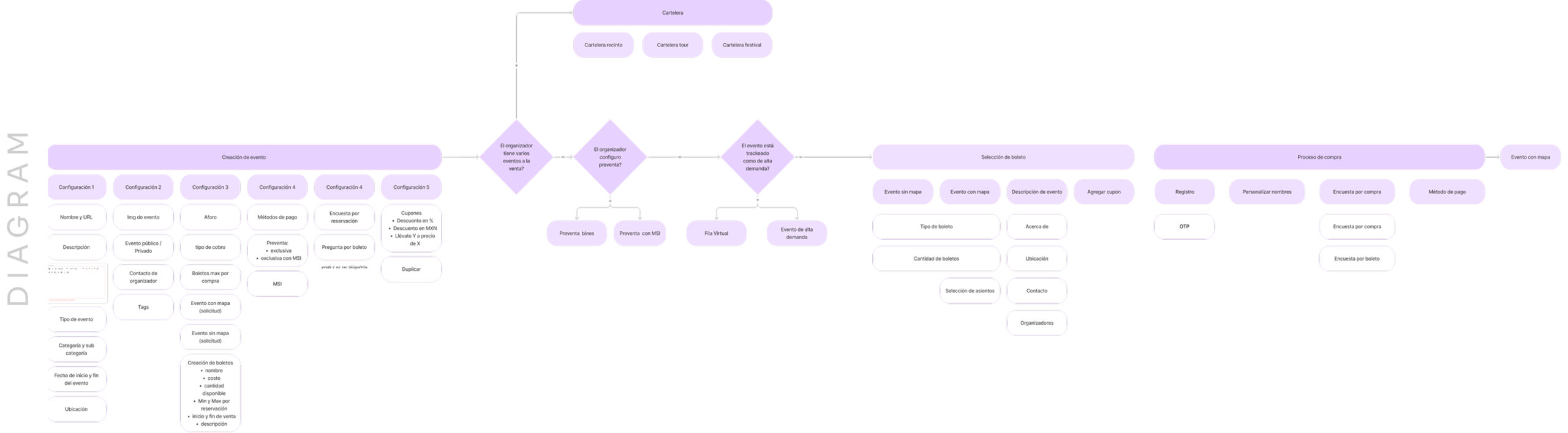
📐 Define & design
Based on the data gathering and insight recollected, defining an building a logical structure was crucial to support better decision-making and ensure a user-centered approach aligning the design between user and business needs and goals.
Marketing and brand managers proposed a change in the brand’s identity colors. It became essential in the define process to have a closer approach with the brand team and implement the new guidelines for colors and fonts creeating a new library for this project.
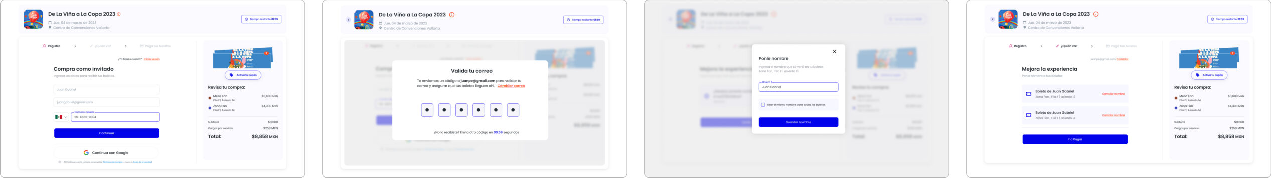
✨ The outcome
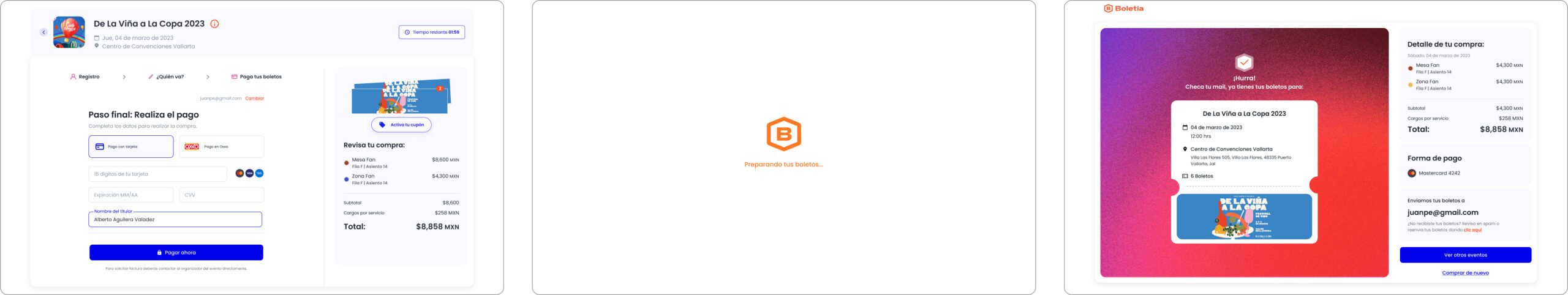
A linear purchasing process was implemented, prioritizing clarity and focus for the different types of events in the market. This approach reduces cognitive load and prevents users from feeling overwhelmed by having to process too much information.
Hand off: use cases, wire flows, prototype, break-points and component guidelines
Results
- Reduced average purchase time by 1 minute
- New friendly and fresh design with impact in all the B2C products
- Optimized information and visual hierarchy
- Minimized errors
- Best seats ticket selection feature
- Costume ticket with name’s attendees feature
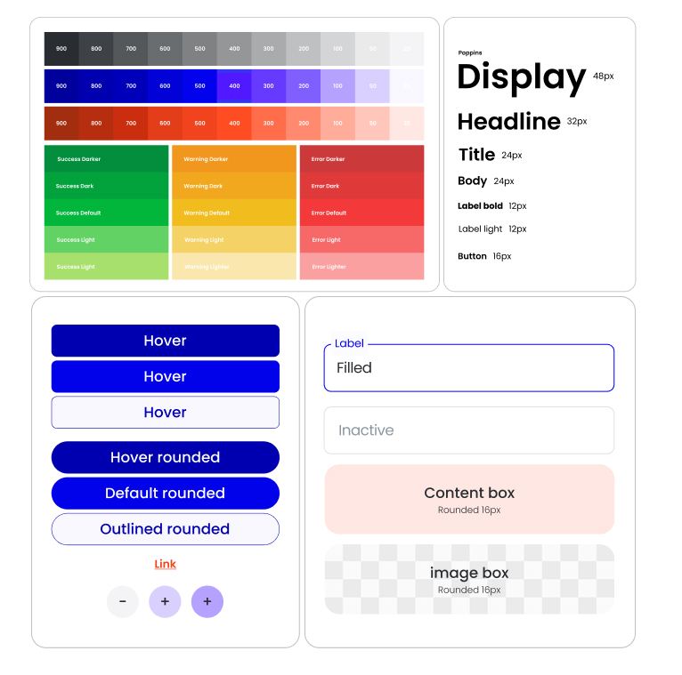
Style definition
It is important to ensures visual and functional consistency throughout all digital products. This creates a cohesive brand experience and helps users navigate interfaces more intuitively and also allows us to scale design and development compositions and features. New features or products can be built faster without starting from scratch.
So for this project it was relevant to start defining the principal components, text and colors.
The library is still a work in progress, the product design team is creating and defining new components and style guides in order to create a design system.
💡 Takeaways
Q/A design & Pilot test
Implement a Q/A focused on design was a important task in my role, because ensures that the product delivers a seamless, and intuitive experience. Also I was involved in the pilot testing with real events to monitoring the product’s quality, functionality, and user satisfaction, while minimizing risks before a full rollout.
Design as estrategy
This is the first time the company has implemented a monitoring strategy for product iteration. I developed specific tracking metrics and funnels that allow real-time performance evaluation and improve the development cycle. Additionally, effective synergy has been fostered among the involved teams, facilitating the creation of customized dashboards that centralize key information and optimize decision-making.
What is next
As a Product Designer, it’s crucial to share the key insights gathered throughout this process, especially to improve the product in future releases. I created a document to present potential features and solutions to the product team, each with different impact scores. This allows us to evaluate how to improve, scale, and provide greater value to our users.