Boletia
The app:
Your tickets secure and at your fingertip, even without internet.
🎟️
Overview
Boletia is a leading ticketing platform in Mexico, acting as the bridge between attendees looking to purchase tickets for events and organizers who create physical and digital experiences. Boletia offers event’s management solutions, from ticket issuance to on-site staff coordination.
📝 Context
As a ticketing platform, Boletia is constantly seeking to become the preferred ticketing service for organizers due to its ease of use. Likewise, it is important to innovate with user-friendly tools that allow users to access their tickets easily, securely, and quickly.
⚠️ Problem framing
One of the biggest challenges for event attendees is keeping their tickets secure and accessible. Currently, Boletia sends tickets in PDF format via email, which has caused issues when users mistype their email or lose the ticket in their inbox. Also their main concerns are fraud and the theft of digital tickets.
🎯 Objective
Build the first Boletia app, designed to provide users access to their purchased tickets. The initial release will focus on allowing users to view and manage the tickets they have bought.
🛠 The process
Understand and identify the current user’s behavior to attend their necessities and goals, before to redeem the ticket. This allow me to create design strategy to build the first features in the app that facilitate the ticket management and enhances security, providing a better experience for attendees.
Points to consider:
- Users behavior
- Error prevention
- User effort
- Design and functionality
- Accessibility
🔍 Discovery
Methodological tools
Survey to current users
Align and prioritize initial ideas with the target audience’s needs, expectations, and potential challenges in early in product development,.
Desk Research
Analysis of existing data that helps to understand the current state of knowledge, identify trends, competitors and inform decision-making.
Interview with tech team
Identify challenges and assess the feasibility of features to ensure the project aligns from the start with technical capabilities and limitations.
✉️ The survey
We sent 10k e-mails to users who bought tickets in less than 3 months in our platform to answers a survey. 3.57% of users answered the survey with interesting insights that help us to build the first iteration of the app.
Tool: Maze
Modules
- Ticket saved method
- Logistics to deliver tickets to companions before/during the event
- Purchase from mobile devices
- User effort
- Redeem ticket
📝 Benchmark comparison
At this stage of the product, I implemented a comparison framework to evaluate different brands and their features. This helped us gain insight into their market position, strengths, and weaknesses. The data was crucial for identifying best practices, discovering new opportunities, and staying ahead of industry trends and technologies.
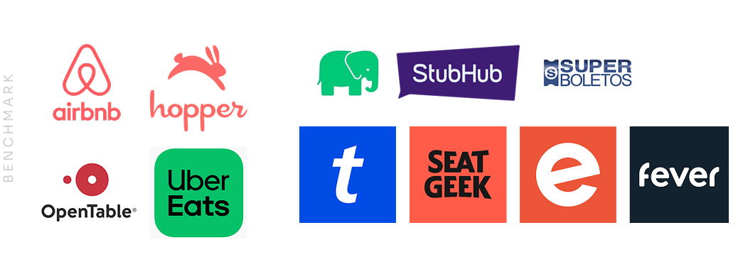
Current apps installed by users
- Onboarding process
- Register process before / after install
- User data required
- Notifications center
- Features that involve retention
Direct & indirect competitors
- Sections, features and structure
- User ticket section and features included transfer ticket
- Register process
- Installs, active users, reviews, retention time
🎟️
Define & design
It is vitally important to generate features that continuously add value for users. An app can become very robust and complex, which is why it is essential to work closely with business areas to align and validate the prioritization of the features to be launched.
After presenting the discovery findings, technical feasibility, and business priorities, the directors of the company concluded that the first release of the app would include only functionalities related to storing and redeeming purchased tickets.
Although ticket purchasing is a standard feature in ticketing apps, the company decided to start with small iterations and focus on aligning and validating the required user information across different platforms before including ticket sales in the app, in order to create the best possible user experience.
Design bases
Consistency: I adapted the components and the library created for the checkout process to be used throughout the app, ensuring the reliability of the brand. With a large amount of information displayed (event details, payment, ticket purchase, seating, prices, user info, etc.), it was essential to keep clarity and organization, making the layout intuitive and user-friendly.
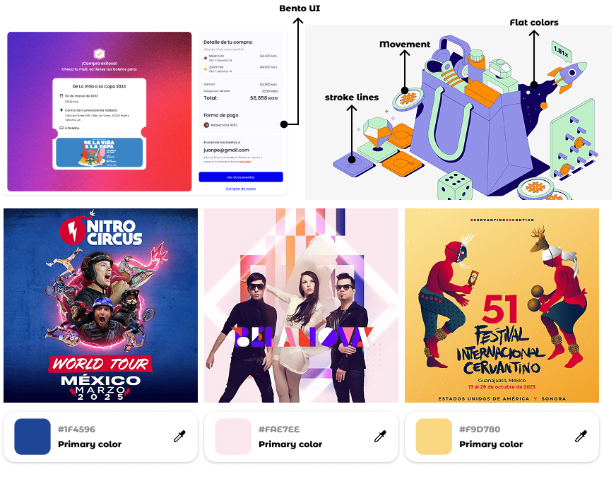
Illustrations: We defined an illustration style that guides users through various steps and features of the app. These visuals not only enhance comprehension but also provide a friendly and approachable feel, offering a visual break and status during the process.
Experiences: Leverage the user’s excitement about attending their purchased events and convey that emotion in the app when they view their tickets by highlighting the essence of the event, extracting the primary colors from the event flyer’s identity.
Take the opportunity to enhance the experience when receiving and transferring a ticket. In the benchmark, we noticed that this process is kept very basic in other companies, treated as just another requirement. Transforming that experience will help differentiate us from the competition. (Idea in collaboration with Mariana Huipet)
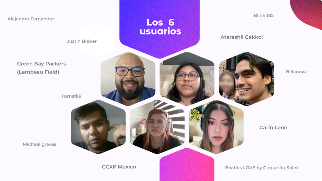
🩺 Usability testing
We conducted six usability tests with experienced event-goers who frequently purchase tickets for events in various cities or countries. Their feedback helped us identify real pain points, particularly in ticket transfers from the first app release. These insights allowed the team to detect bugs across different devices, improve the copy for clearer understanding, and enhance the UI for optimized usability.
To ensure everyone in the company is aligned with user feedback, I created and presented a summary of the key insights. This helped various departments stay connected to real user needs and work together to create a more positive product experience.
Design critique
I implemented a workshop with the design team to analyze and propose improvements to the flows created and tested by users, highlighting the pain points they encountered during usability testing. Some of the proposals included navigation solutions, flow structure adjustments, and even suggestions for new functionalities. With this information, together with the product manager, we were able to include improvements that enhanced the user experience and/or required low technical effort in the upcoming sprints. Additionally, I created the first design backlog for future improvements and iterations of the app.
🎟️ The outcome
The app was launched in June 2024 to conduct pilot tests with real events and verify the use of dynamic QR codes and access to them even without internet. Since the app team was small, I was also responsible for designing the mailings and creating content for the app stores.
Results
- Reduced average purchase time by 1 minute
- Optimized information and visual hierarchy
- Minimized errors
- Automatic ticket selection
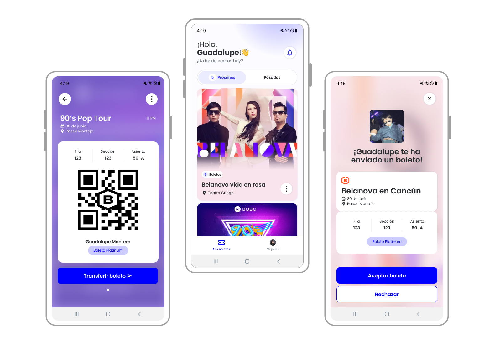
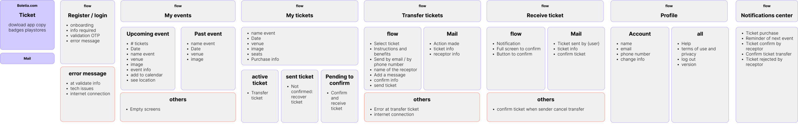
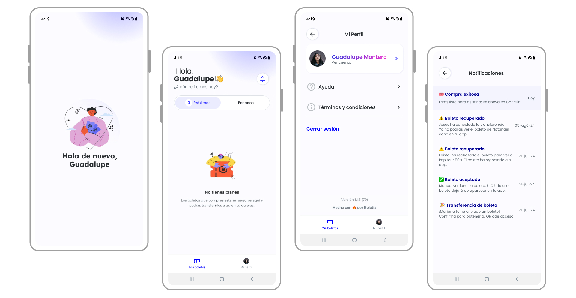
My tickets
The main section in this first iteration. The user would be able to see the upcoming events and the section of past events showing a history of attended events
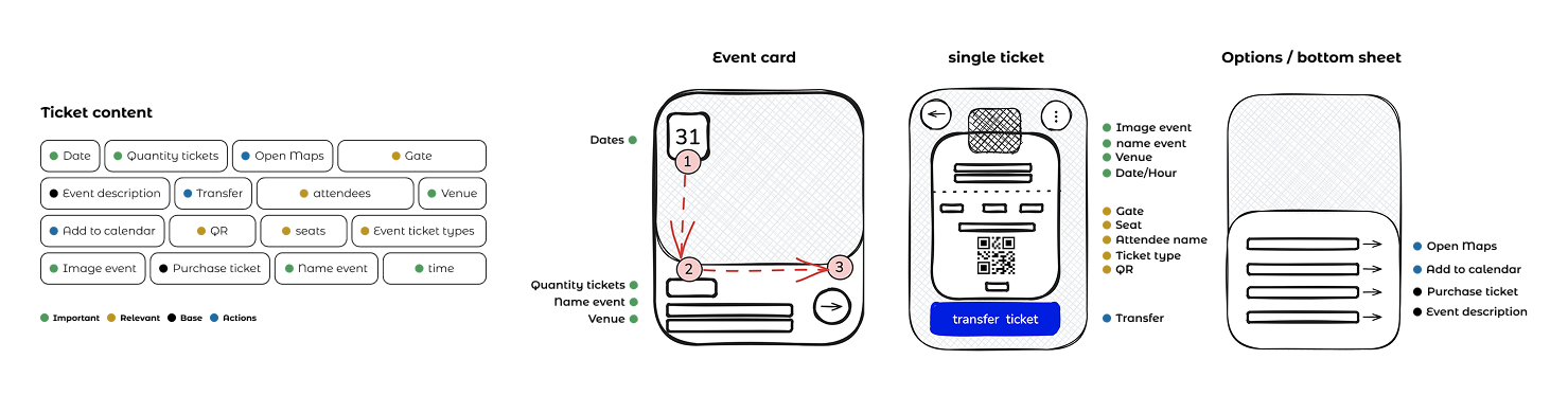
Event card: This card is created to provide related information about the event to attend, also it has shortcuts to add to calendar, see location and the event description or summary purchase.
Each card will customize its primary color based on the main color used in the event’s banners. We aim to leverage the user’s excitement about attending their purchased events by reflecting that emotion in the app when they view their tickets.
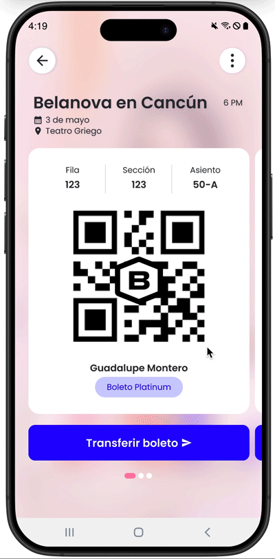
Tickets screen
The main objective is to show the QR to access the event, and the relevant information as seats and gates. The screen ticket will highlighting the spirit of each event.
During the checkout process, users can add the names of the attendees. This information helps users easily identify each ticket, and in case they need to transfer a ticket, they can update the attendee’s name accordingly. This sections was built in order the user can open and see dynamic QR access ¡even without internet!
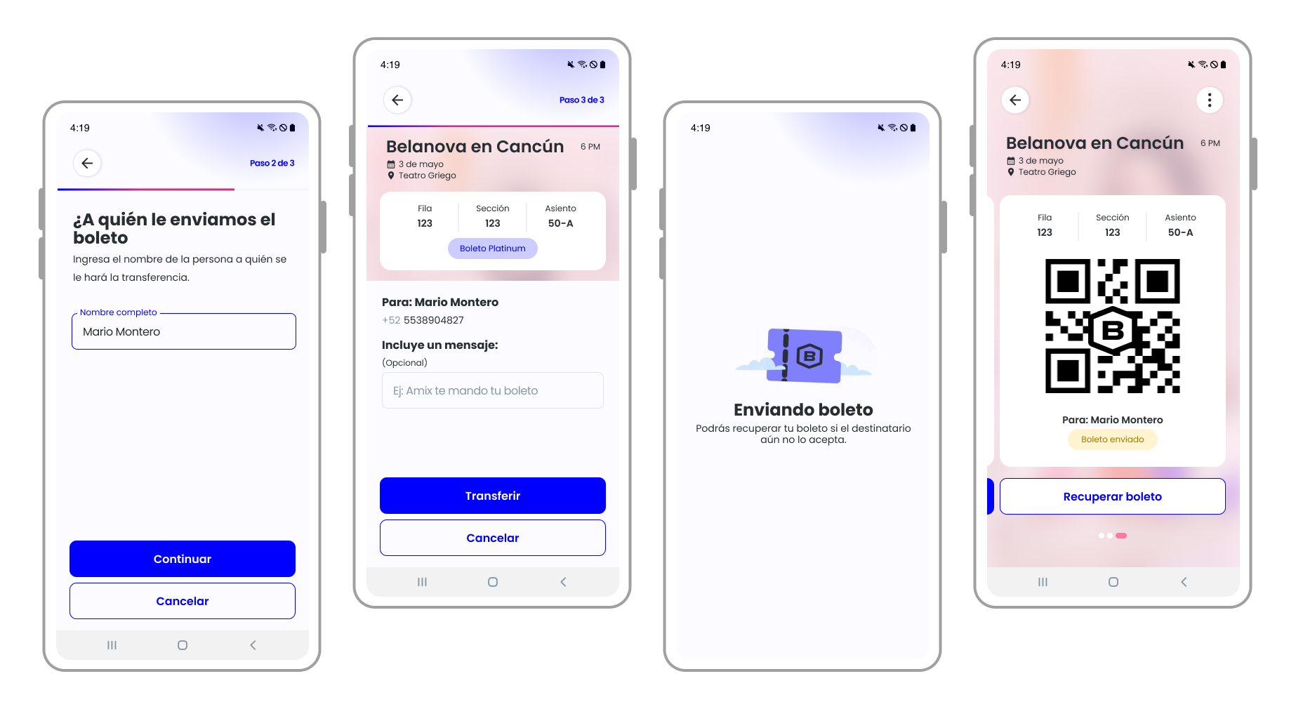
Ticket transfer
According to the interviews and benchmark, most of the users used to buy tickets and share with close friends and family, this could be because they’re going to assist together. For this functionality, it was necessary to design different flows and status scenarios and use cases for both the sender and the receiver, creating various communication channels — such as SMS for non-users, push notifications for users with the app, and email for both.
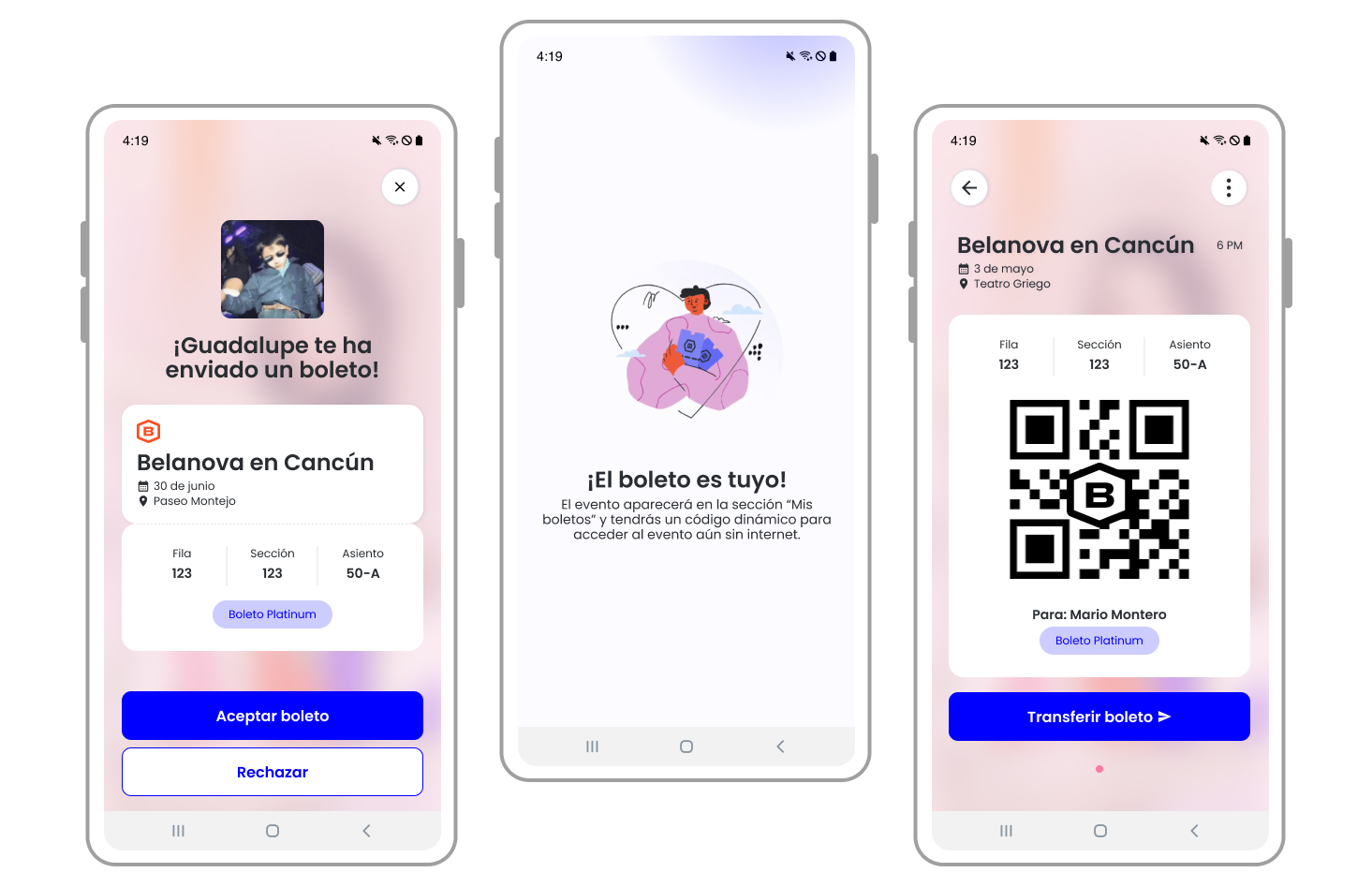
Receive a ticket
People can receive tickets even without having an account, but they will need to create one in order to confirm and access to the ticket. Specific user flows and use cases were developed for this process. The focus was on delivering a positive experience when accepting a ticket, which is why we emphasized micro-interactions to enhance the moment. One example was the selection of four popular GIFs that evoke happiness and celebration.
Use cases and secondary sections
💡 Takeaways
Lo mismo pero no revuelto
There will always be ways to differentiate yourself from the market while maintaining the same standards. I believe the key is to focus on the added value you can provide to users and how you can make their experience easier or more intuitive – without the need for overly complex features. This can range from improving copywriting, simplifying processes, and engaging with users repeatedly, as often as necessary.
Un paso adelante
Following multiple handoff sessions with the tech team, it became essential to define the next steps, despite the app not yet being launched.
To support this, I developed a document detailing the possible key performance indicators (KPIs) to be tracked at the app level, including active users, retention rates, account creation, and uninstall metrics.
In parallel, I collaborated with the marketing team to create a content strategy aimed at managing and responding to app reviews, enabling us to segment user feedback and establish effective follow-up processes.
Furthermore, leveraging the backlog generated from the design critique sessions, a prioritization workshop was conducted with the app team to identify high-impact functionalities — such as wallet integrations, gift card options, and other features — with the goal of setting clear objectives to enhance user retention and drive acquisition.
What is next

The implementation of ticket purchasing and an event catalog within the app was a design-driven initiative aimed at making the app more robust and maintaining the entire ticket purchase and access cycle in one place. Therefore, it was time to think about how to scale the app, create diagrams, and develop the first prototypes for these sections — including considerations for integrating new functionalities, such as enabling ticket resales directly within Boletia.