Stori
The application process:
learn, act & improve fast
🎟️
Overview
People come from difficult financial situations, and they’re looking for a second chance to show to themselves that they can have a healthy financial life, improve their lifestyle and have access to new financial opportunities. Stori card is giving the chance to all the mexicans to have access to a credit card and improve their credit history.
📝 Context
Based on the data through May, June and July, we have detected drop offs in the beginning of the application process in the app.
⚠️ Problem framing
The percentage of the people who start the application and create the account is low compared to the people who install the app
🎯 Objective
Understand the behavior of the user who interact with the sign up in order to detect problems and adapt our application process and value proposition to their needs.
🔍
Discovery
- Design Strategy
- Problem research
- Business strategy
- Competitor Analysis
✍️
Define
- User research
- Data gathering
- Evaluation
💡
Ideate
- Brainstorm
- Planning Testing
- Information Arquitecture
✏️
Design
- Lo-fi wireframe
- Hi-fi wireframe
- Visual design
- Prototyping
🛠 Methodological tools:
- Surveys: We will know the reasons of the people who abandoned the application process in this step, and it motivations to download the app
- Desk research: It will allow us to evaluate and compare the options that other actors offer to carry out this same process and to know the market standard
- Usability test: it would help to evaluatea product or service by testing it with representative users.
🗒 Survey behavior module
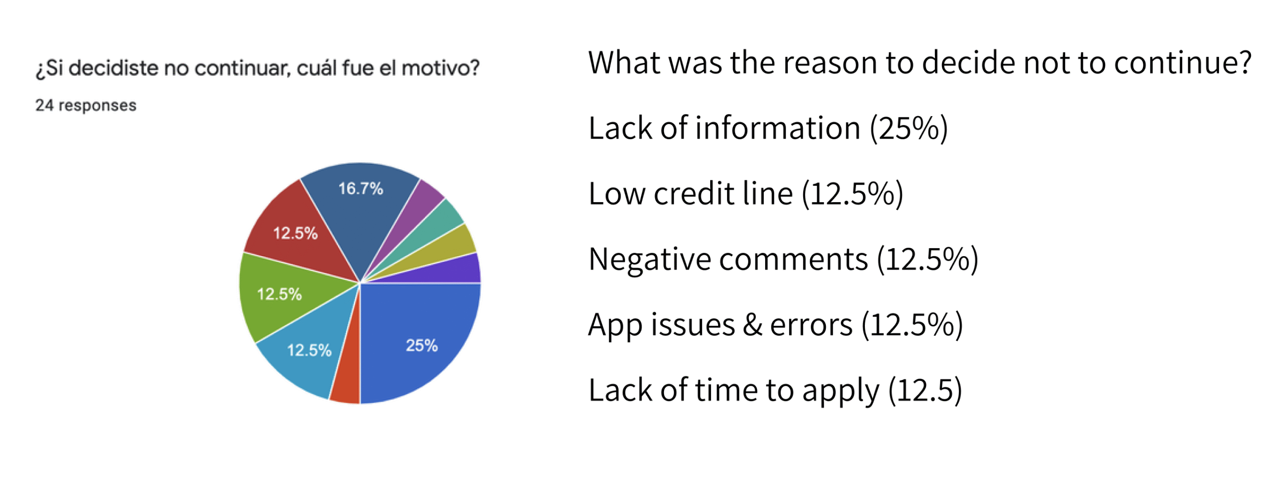
🗒 Survey value proposition module
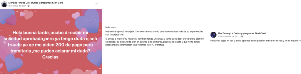
👂Listening of social media / Google, iOs Stores
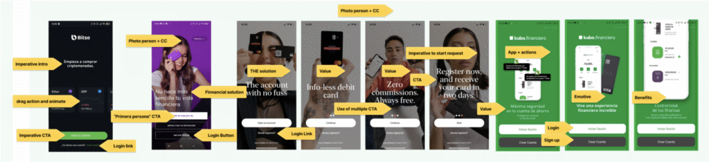
👀 Desk research
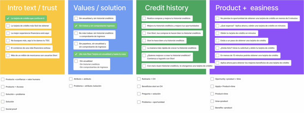
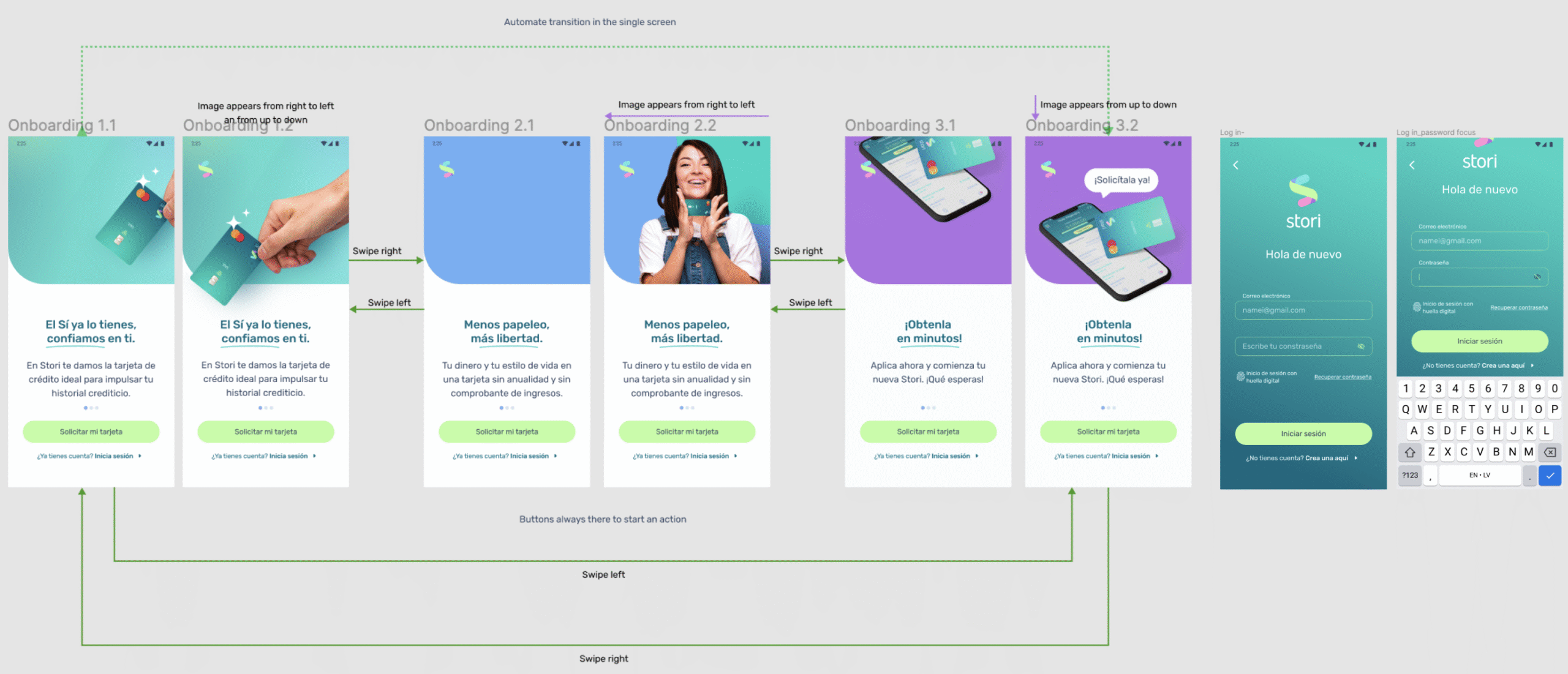
Considering the onboarding of digital products it is important to show more than one screen to present the product and it benefits, some of them use automatic transitions to show the information. This information is clear and short, always next to an image that helps to explain the product. ( the credit card is always there)
❓
Is it correct the actual way to display the information?
❓
Does the information presented help the user to understand the product?
❓
What kind of information is needed to make the user trust us?
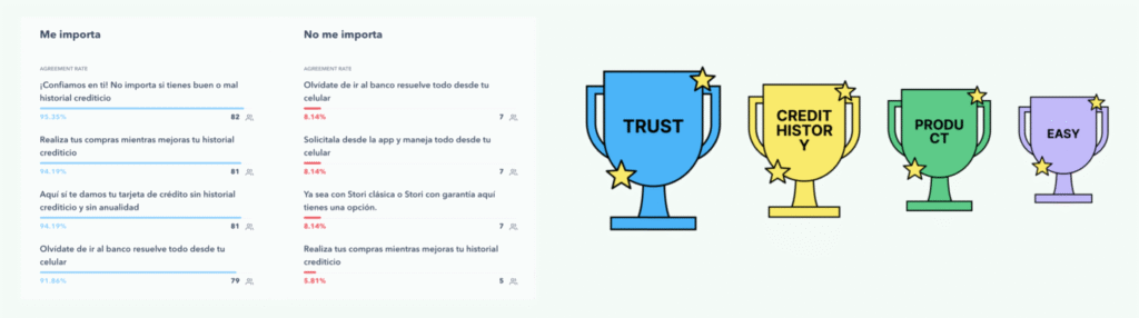
🗣 Narrative / value proposition
It is important to provide information that help to understand value and product. so it is very important to present our value propositions, plus the benefits of request the card
🧠 Usability Heuristics for User Interface Design
✨Visibility of system status
✨Match between system and the real world
✨User control and freedom
✨Consistency and standards
✨Error prevention
✨Aesthetic and minimalist design
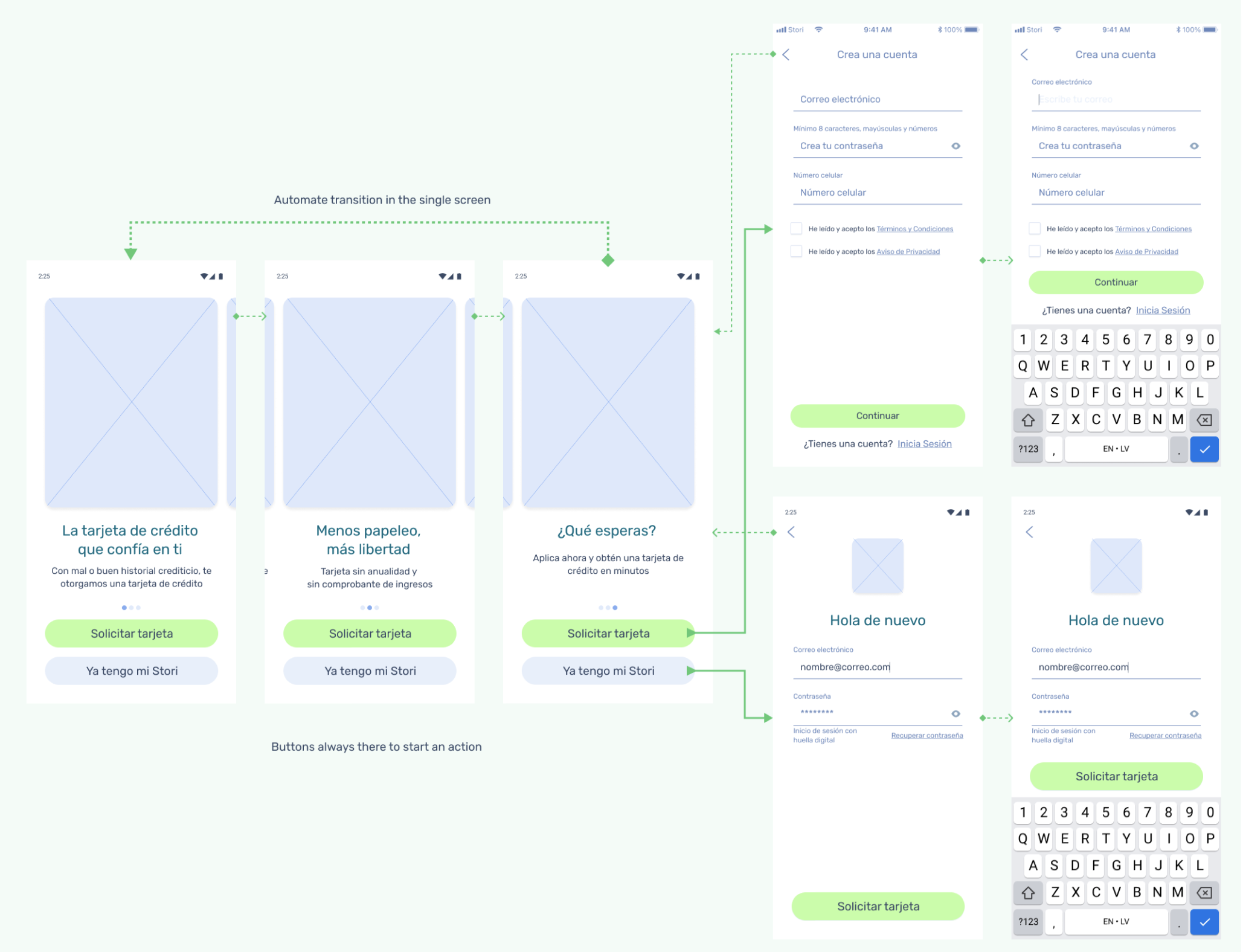
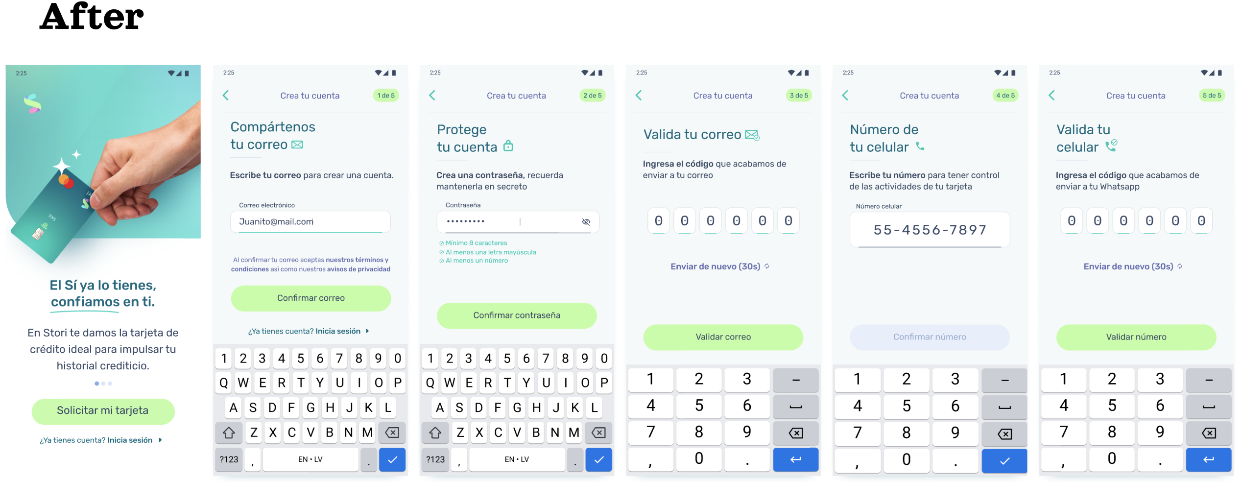
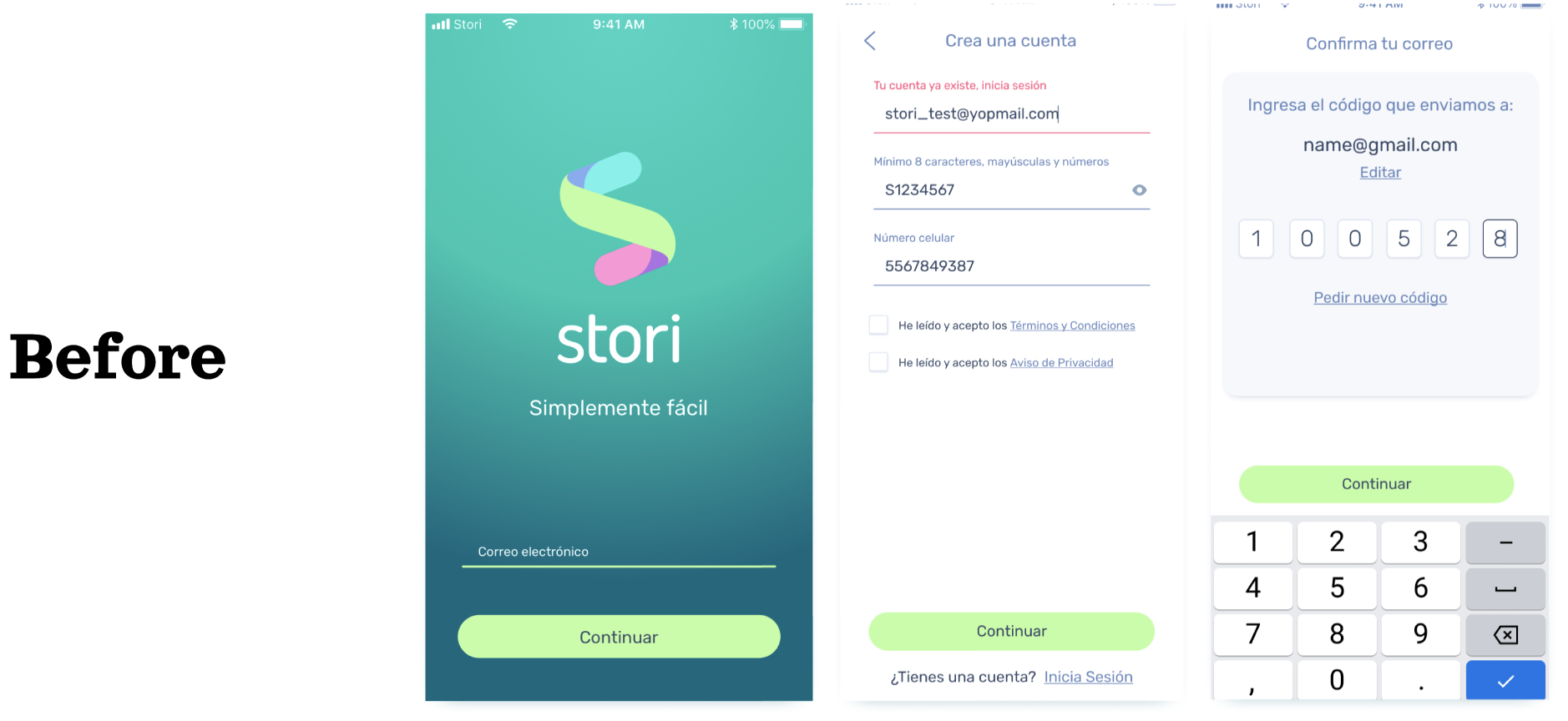
✍ Wireframes lo-fi
The creation of user flows was unnecessary in this first iteration, the team decided that the structure in back-end would be the same in order to keep low level of effort and the objective was to prioritize the architecture of information, reduce the cognitive load and improve the UI.
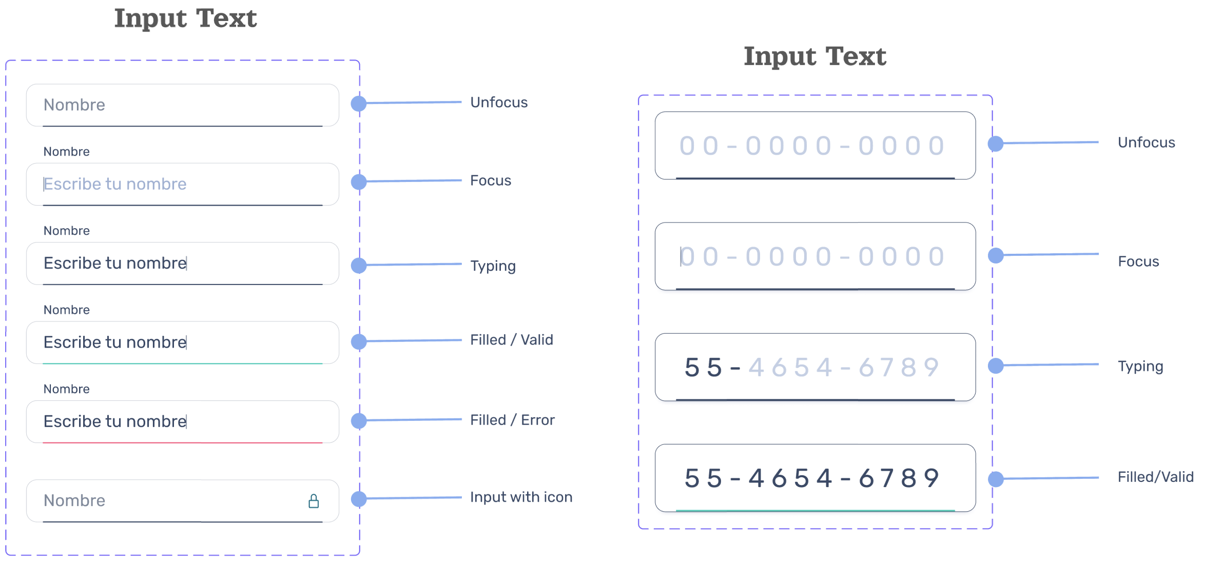
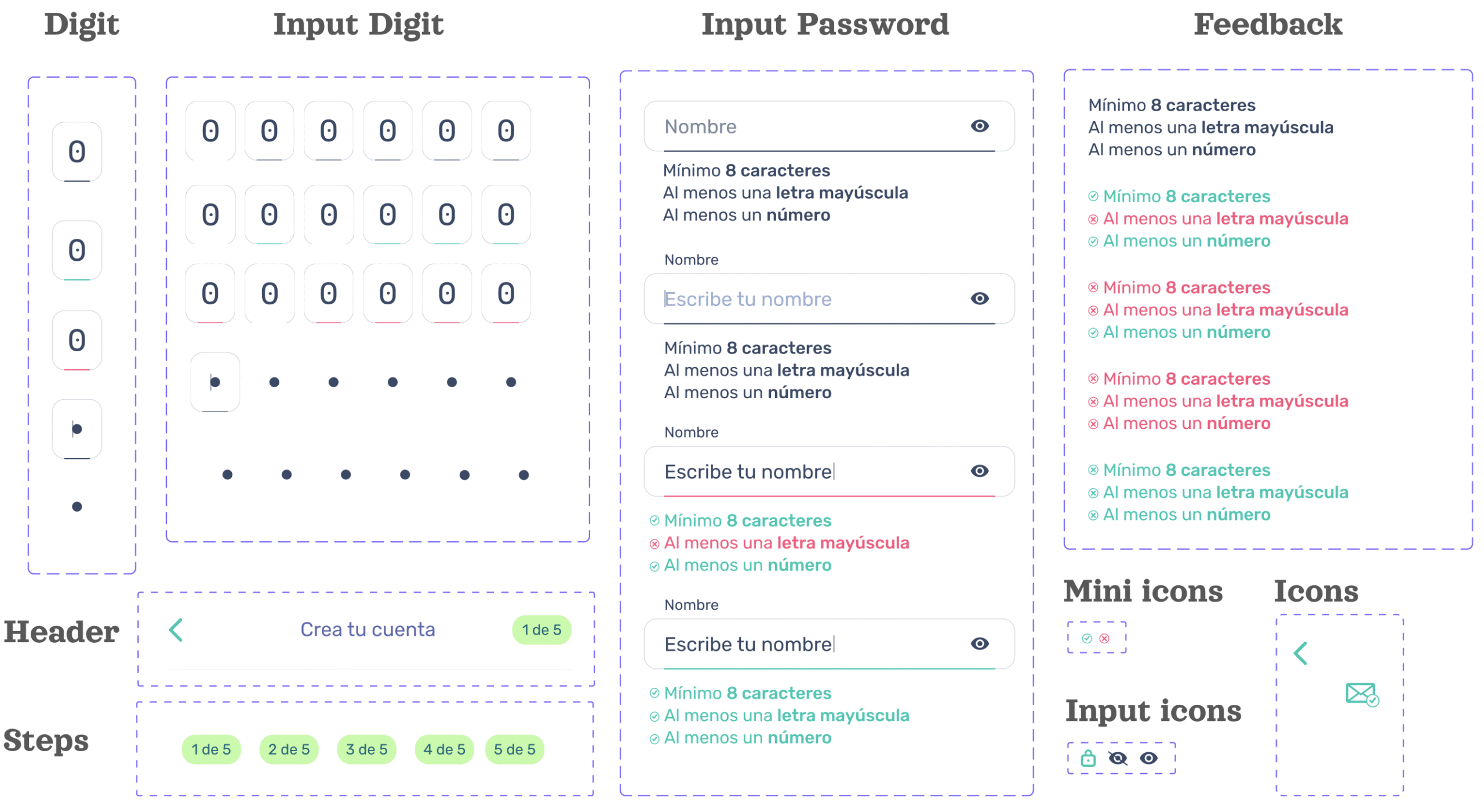
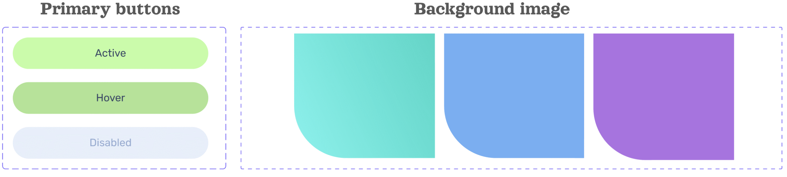
✏️ Design library
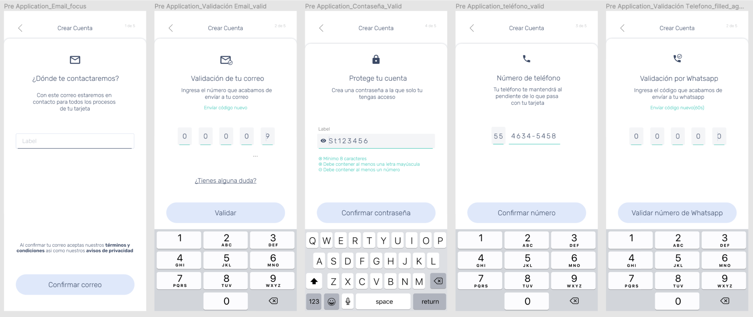
✍ Wireframes hi-fi
🕵️♀️ Unmoderated usability testing (Maze)
A remote usability test was run with 31 responses of active customers to understand the interaction of the onboarding and to validate the values+ benefits: to know if it is important to the user this information to continue the request or login the app
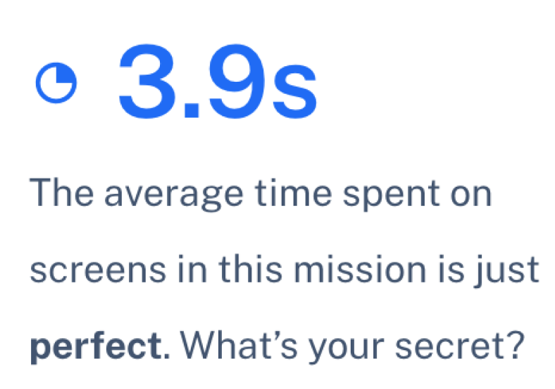
The user spent 3.9 seconds on the mission, this give us the idea of how many time the user will waste watching the onboarding, scanning the text understanding the instructions to make an action.
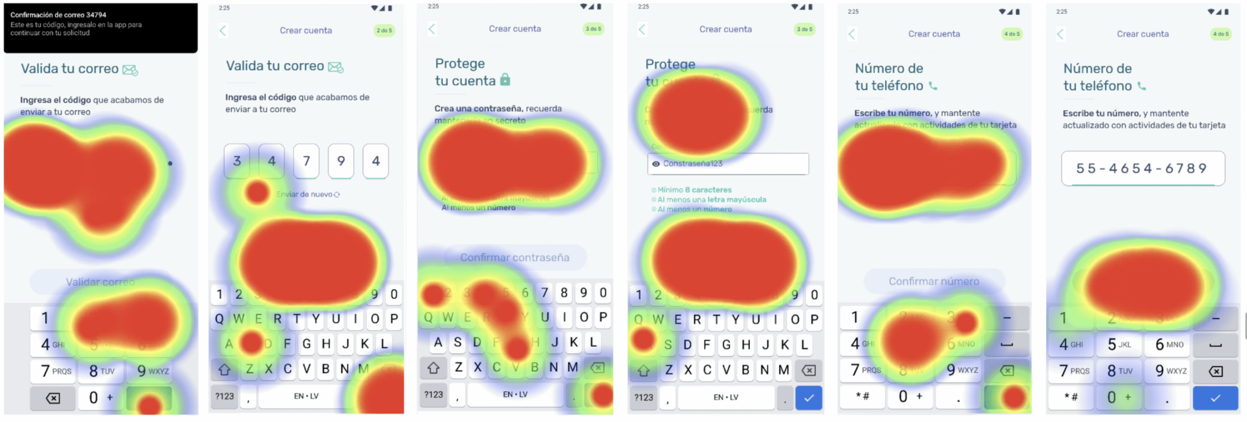
1.6% The flow average misclick rate is excellent. Only few testers got lost.
In the flow the testers during no more than 1.2 secs, so the user is not going to spend too much time understanding the instructions
👁👄👁 Perception
The perception of all the interaction will give us a more accurate approach to the information.
Question 1: to know what kind of information is attractive when they want to obtain a credit card from their cellphones

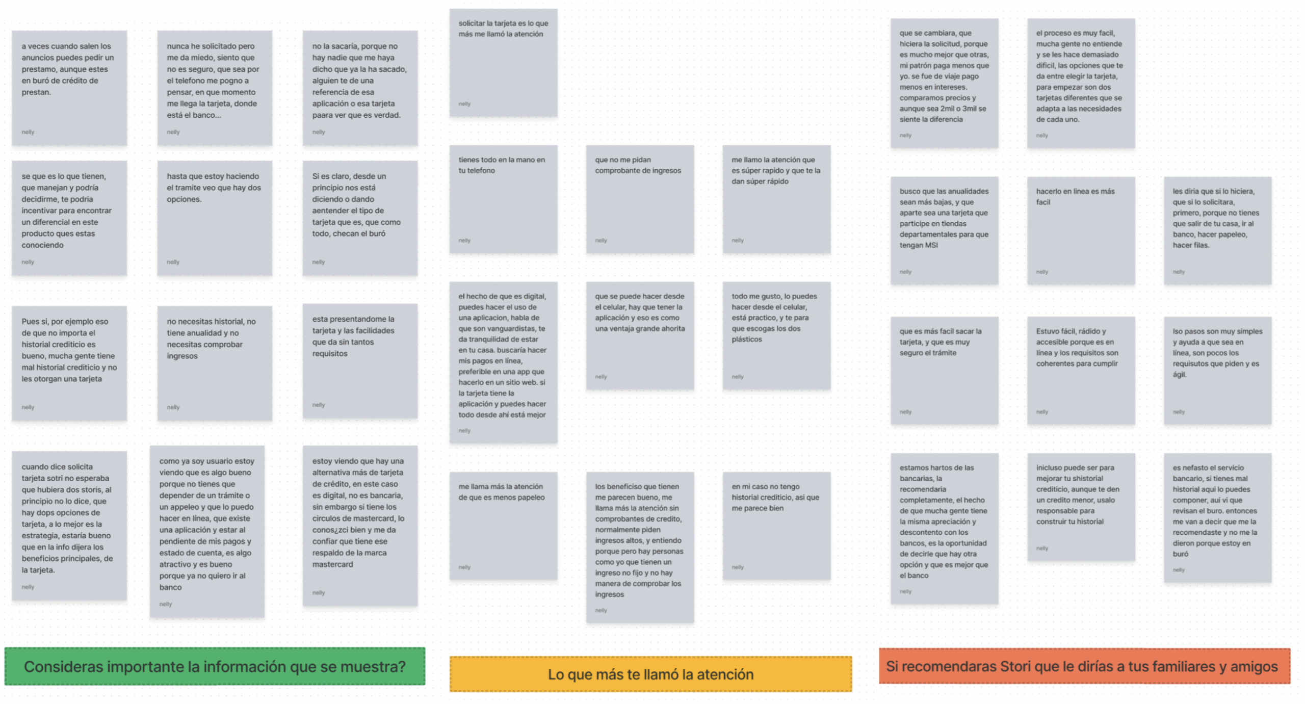
🕵️♀️ Usability test moderate (remote)
We made some adjustments after the highlights and ran a moderate usability test with 10 non customers to understand the interaction of the onboarding and to validate the values+ benefits: to know if it is important to the user this information , and if they understand why we are asking for this information. with this we iterate the last round before the handoff with tech team.
💳 The outcome
The new composition was launch in all the application process, improving not only the signup but also the following steps such as KYC. after that we were preparing the next iterations focused in user pain points and accesibility
Results
- The flow proposal has a better performed behavior in production with real user, increasing the sign up rate by 10%, while the creation of the account increase at 8%.
- We detected some issue with the phone OTP validation and prepare the research and the iteration that allow us to fix it and reduce the drop off and increase the phone validation rate at 10% in the future sprints
💡 Takeaways
A Mexican unicorn
Thanks to the closer approach to real users, act fast and learn deeper, Stori became a unicorn in July 2022, reaching a valuation of $1.2 billion and we provide credit to more than 1 million underbanked consumers in Mexico.